
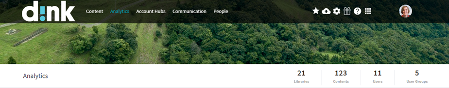
When opening the d!nk Analytics:
You will find a menu bar at the left for the details per topic.
The first one is about the 'Activation':
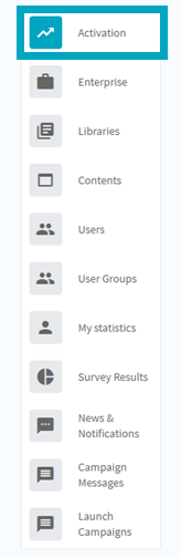
In the 'Activation' menu you can check the
- User Adoption
- Activation Timeline
- User Engagement
- Client Engagement
1. User Adoption
In this funnel you can follow up in what phase your users are today.
Are they still inactive or at least ready to use the app? Or are they in the process of discovering the functionalities, very active or already advanced in the usage of d!nk?
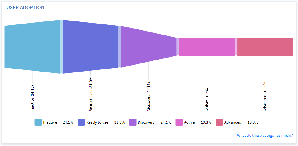
When you click on one of the categories in the funnel, you will get a list of the users that belong to it.
The explanation of the different categories you can find right here.
2. Activation Timeline
How is the adoption evolving in time?
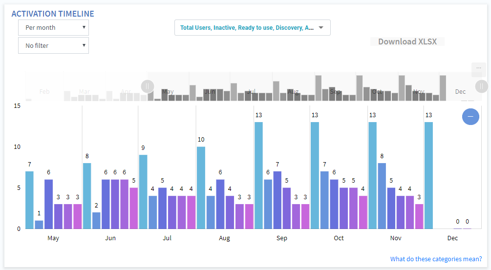
With the dropdowns at the left you can choose the timeframe and filter on region, country or user group.
The dropdown in the middle allows you to only select the categories you would like to see in the graph.
If you want to adapt the timeframe even more specific than the options available in the dropdown, you can adapt the slider on top by moving the buttons at the left and/or right: 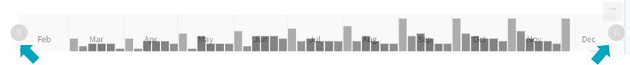
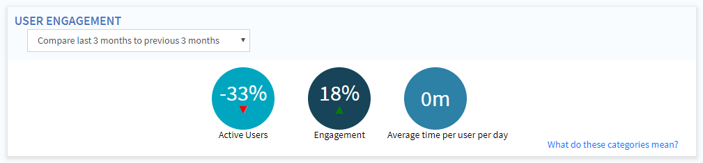
3. User Engagement
Here you can compare the current user engagement to the engagement in the past, for 24h - a week - a month - 3 months.
4. Client Engagement
In this overview you can compare the current activation and engagement of the Account Hub usage by clients to their engagement in the past, for 24h - a week - a mont - 3 months.
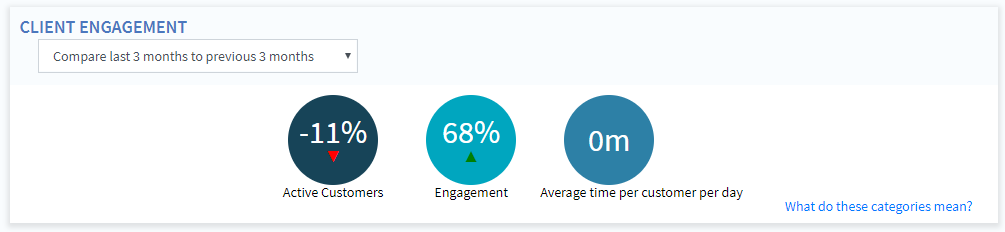
Active = Account Hubs that have been visited in the last 14 days*
Engagement = Number of visits in the selected period
*The default timeframes can be adapted based on the KPI's of the company in the 'Settings' > 'Analytics settings'.
Want to find out more? Go to the next article about the 2nd menu: Enterprise analytics.
Comments