
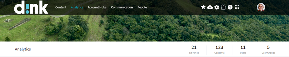
When opening the d!nk Analytics:
You will find a menu bar at the left for the details per topic.
The seventh one is about 'My statistics':
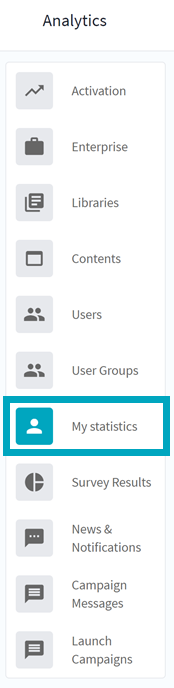
In the 'My statistics' menu your details will be shown straight away so that you can check:
- Access Overview
- User's Interaction
- Content Usage
- Content Slide Interaction
- Account Hubs
- Campaign Messages Sharing
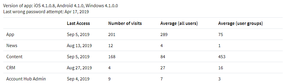
1. Access Overview
This overview will tell you straight away what your latest installed app version is, on all devices you're using. It will also tell you what the latest access was and the exact number of visits for the App, Newsfeed, Content, CRM and the Account Hub Admin environment:
2. User's Interaction
This graph will show you your activity for the last 90 days - 6 months - last year - all time:

Hoovering over the dots on the lines will display the exact duration.
Clicking on them, will generate a pop-up with the publications used.
If you want to adapt the timeframe even more specific than the options available in the dropdown, you can adapt the slider on top by moving the buttons at the left and/or right:

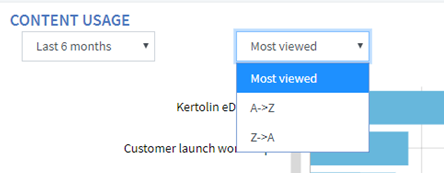
3. Content Usage
You want to know what publications you're using mostly?
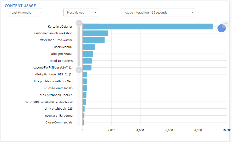
With the dropdown at the left you can select the timeframe of your choice.
By hoovering over one of the bars in the graph, you will get the exact timing details presented for that publication.
By sliding the buttons up or down wards, you can zoom in on the presentations you want to see:
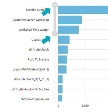
With the dropdown in the middle of the graph, you can choose the order:
4. Content Slide Interaction
How are you working with a specific publication?
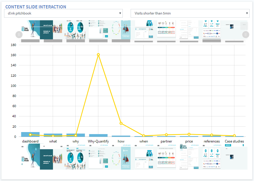
Check out the number of visits and the average duration spent per slide.
For larger presentations you can zoom in or out by moving the grey buttons at the top of the graph to the left and/or right.
5. Account Hubs
This graph will show you the account hub creation for the last 90 days - 6 months - last year - all time:
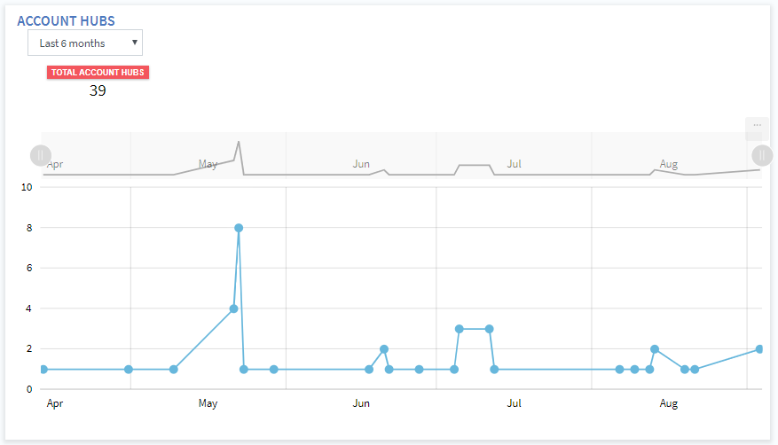
Hoovering over the dots on the lines will display the exact number of account hubs.
If you want to adapt the timeframe even more specific than the options available in the dropdown, you can adapt the slider on top by moving the grey buttons at the top of the graph to the left and/or right.
6. Campaign Messages Sharing
This graph will show you the sharing of the campaign messages for the last 90 days - 6 months - last year - all time:
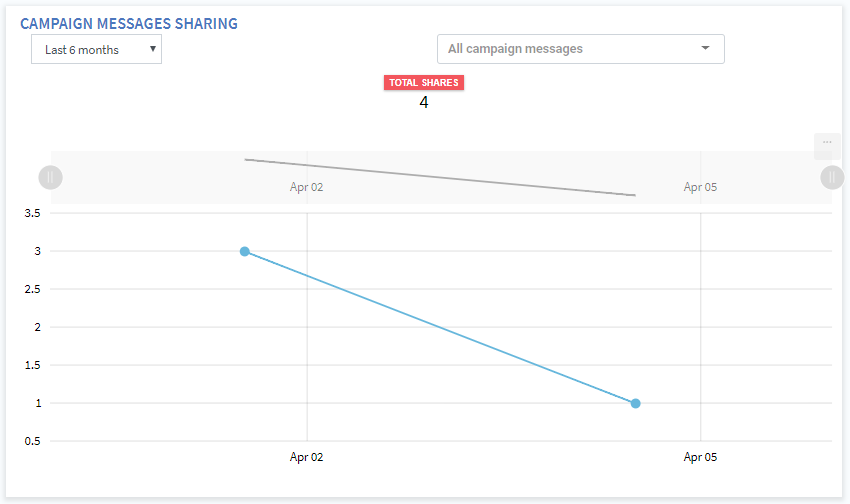
Hoovering over the dots on the lines will display the exact number of shares.
If you want to adapt the timeframe even more specific than the options available in the dropdown, you can adapt the slider on top by moving the grey buttons at the top of the graph to the left and/or right.
Want to find out more? Go to the next article about the 8th menu: Survey Results
Comments